Efortles Transaction Classification
Efortles Inc. provides free CPA and accounting services for small businesses across New York. Their offerings include bookkeeping, payroll reporting, income and sales tax preparation.
Role
User Experience Designer
Tools
Adobe XD
Team
Zona Liao
Duration
October 2020 - November 2020 (4 weeks)
OVERVIEW
As a Product Design Intern, I contributed to the Efortles mobile app by working on wireframes and visual design, with a focus on improving transaction organization for small business owners. My goal was to create an intuitive, clean, and informative interface that helps users easily track and categorize their business spending.
PROBLEM STATEMENT
Small business owners often struggle to keep their finances organized. They need a simple, efficient way to track, categorize, and manage transactions to ensure they stay within budget and keep their businesses running smoothly.
USER RESEARCH & INSIGHTS
78% of small business owners were unsure of where their money was going each month.


COMPETITOR ANALYSIS
The competitors I analyzed used minimal interfaces with large buttons and very few steps to complete a transaction to keep the user flow intuitive — principles I applied directly to Efortles.


SOLUTION
How might we...
help small businesses clearly track and categorize their transactions so they can better understand and manage their finances?
Mobile Interface Designs
Transaction Entry Screens
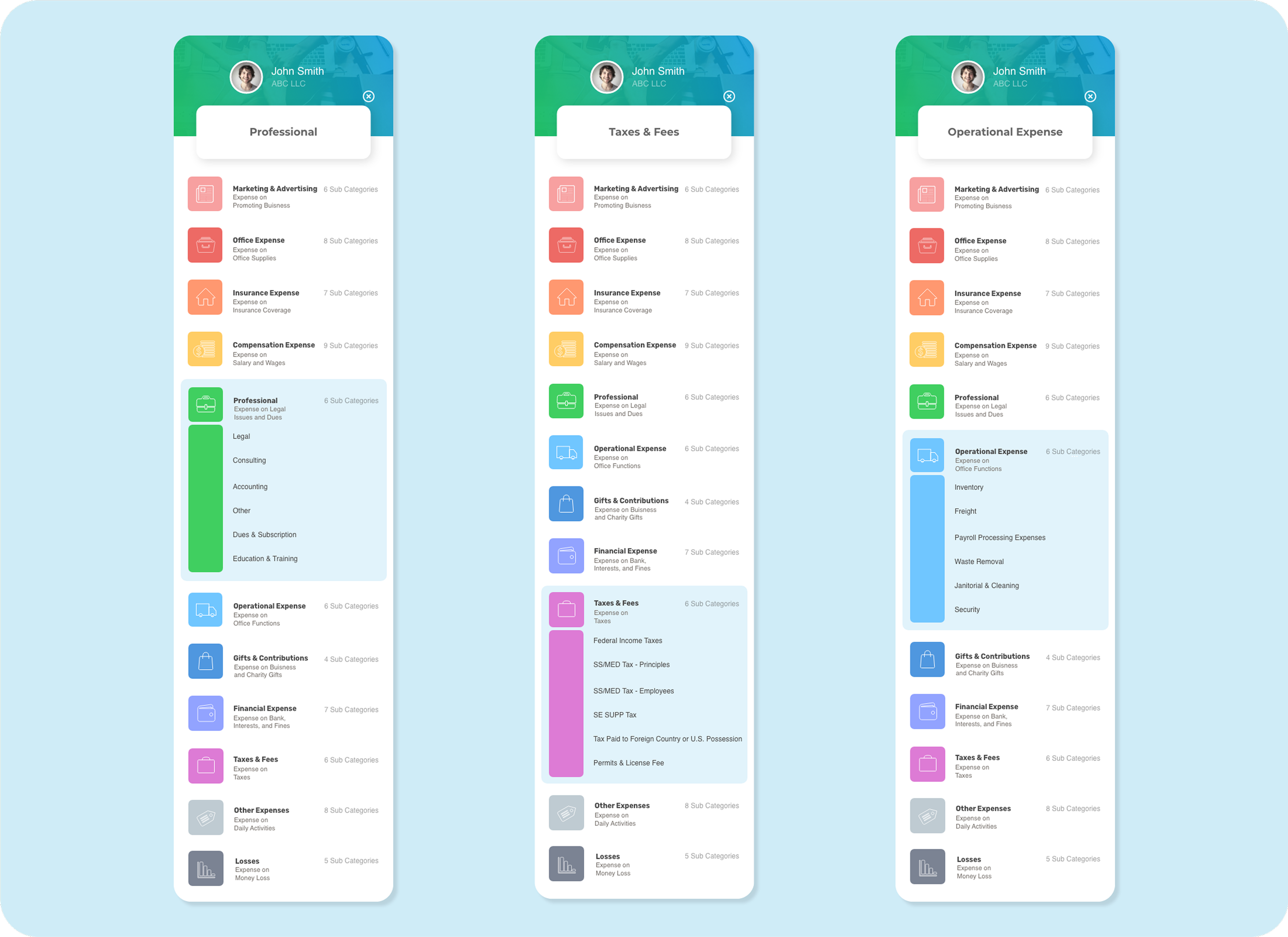
Transaction Classification System
New Employee & Contractor Payments
Payroll & Transaction Breakdowns

Transaction Entry Screens
I developed input screens for the Shareholder Activities, Business Mileage, and Cash Activities by incorporating fields based on real data pulled from Efortles’ website and internal documents.


Transaction Classification System
I built a categorization hierarchy (Assets, Liabilities, Equity, Income, Expense) and developed subcategories using data from Excel spreadsheets provided by the company. Then, matched each category with a unique color and icon to aid recognition while inputting transactions.


New Employee & Contractor Payments
I designed dedicated screens for adding new employees and independent contractors by creating structured forms to input essential information: name, employment type, department, payment frequency, and tax details. The contractor-specific interfaces manage one-time payments while the employees had recurring payments.
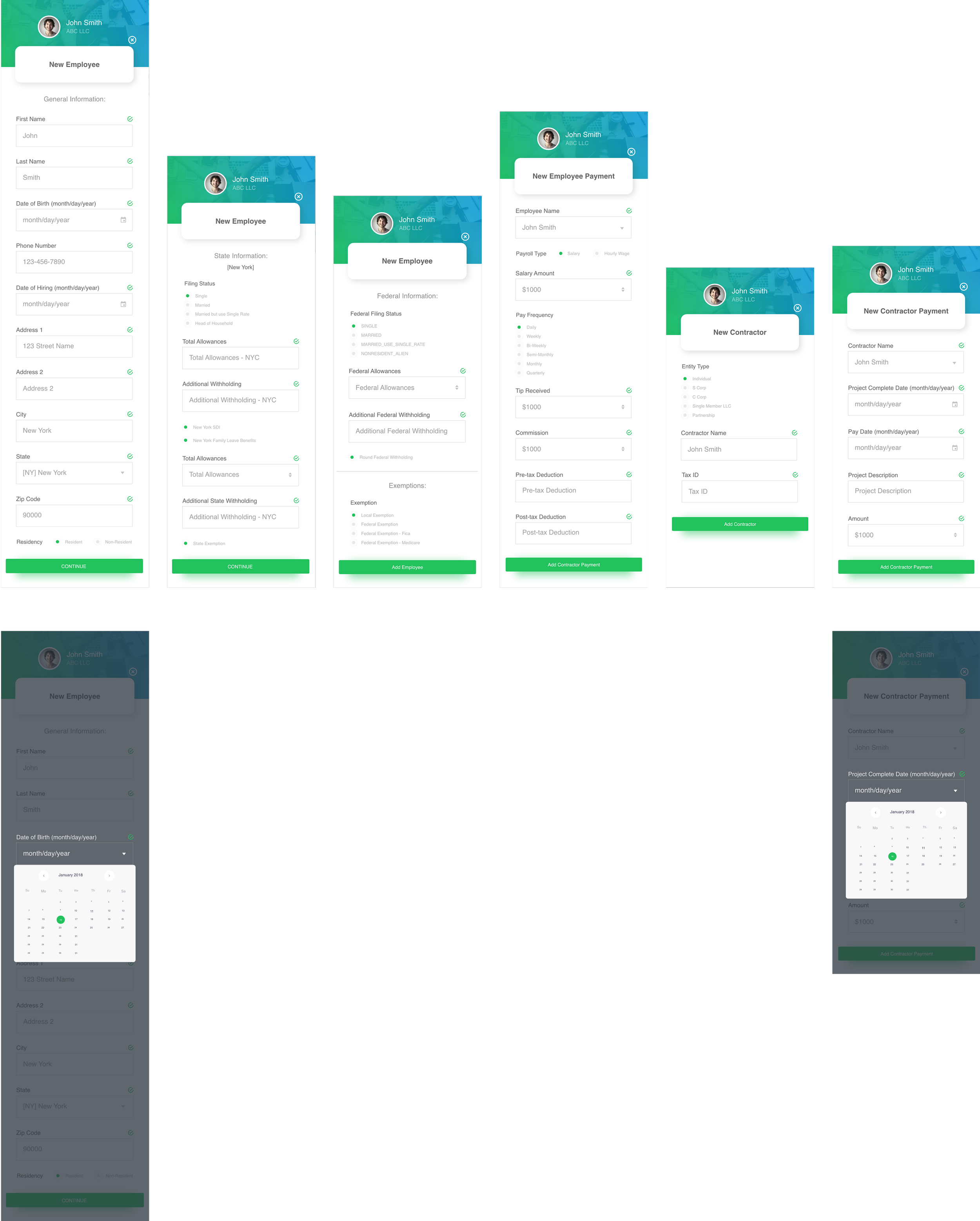
————————————————————————————————————————→
The user flow for these mobile screens follow from left to right with the exception of the pop-up calendar date selection as seen within the same screen above it.

Payroll & Transaction Breakdowns
The Transaction Main Page acts as the central hub for users to view, sort, and manage their financial activity. I designed this screen with clarity and usability at the forefront with summarized total income, expenses, and cash flow at the top for quick reference.
To support both internal employees and external contractors, I designed a set of streamlined payroll management screens with employee payroll overview as well as the contractor payments breakdown.

VISUAL DESIGN & STYLING
The icons were customized with gradient fills to complement the overall aesthetic and a rainbow-inspired visual order was used to make the UI more engaging and organized.
PRIMARY COLORS: Sky Blue (#0E9ED8), Black Coral (#4E5B6E)
ALERTS: Success (#2ECC71), Warning (#F1C40F), Failure (#E74C3C)

TAKEAWAY
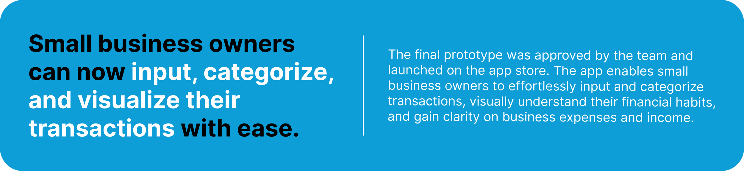
Simpler input sections and intuitive categorizations in the mobile application made the process and user flow smoother.
ICONS: minimal design, classification use