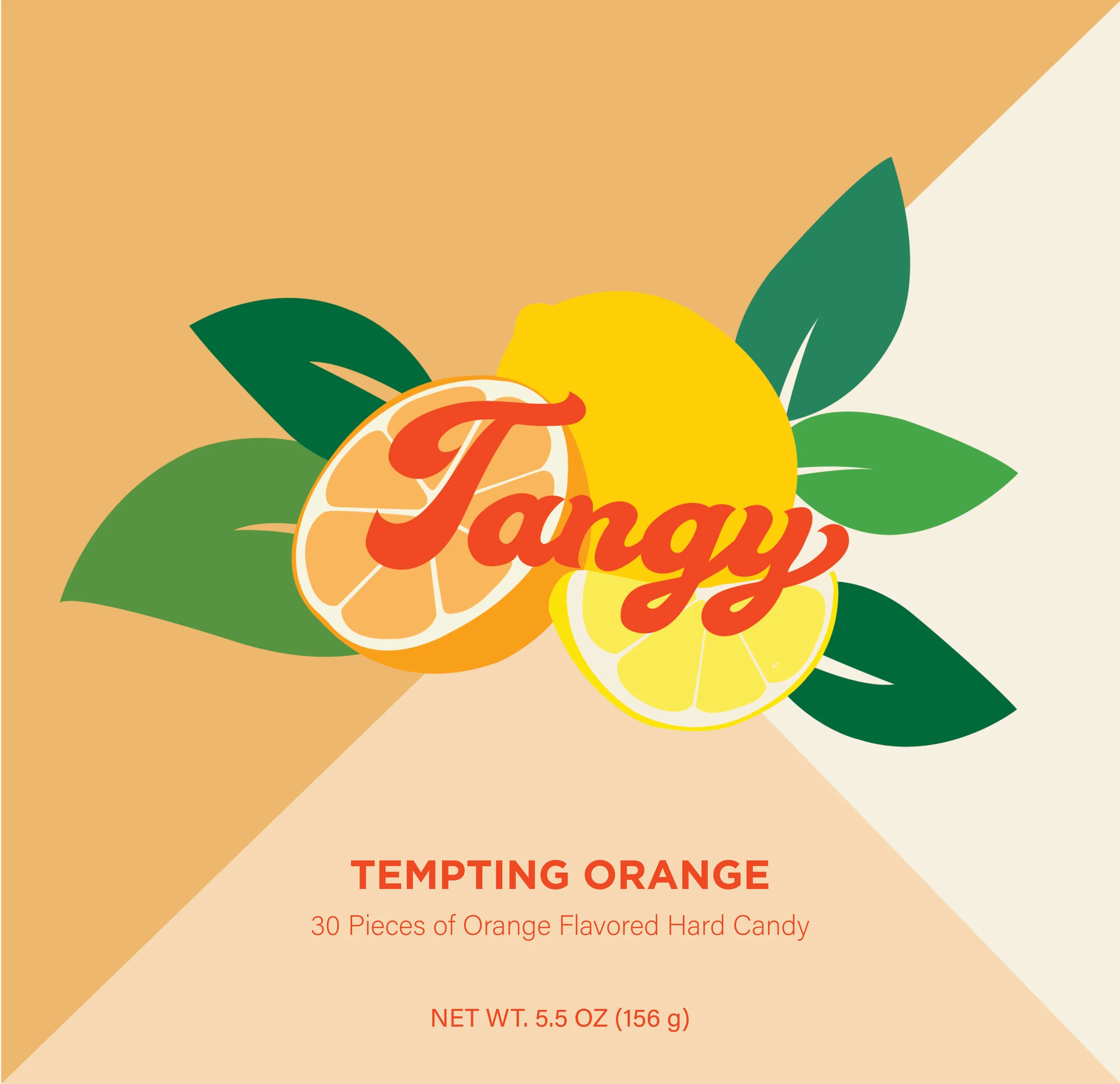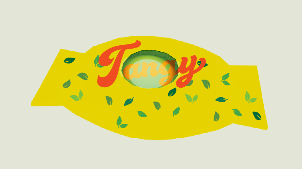
Tangy!
Tangy is a lemon and orange-flavored hard candy brand company that I created through a Word + Image class assignment. My candy concept revolves around my childhood experience of eating similar hard candies with my sisters as we were growing up. I love the sour and sweet taste of these candy creating this “Tangy” feeling within. Inspired by my memories, the candy packaging embodies the child-like energy that I wanted to recreate.
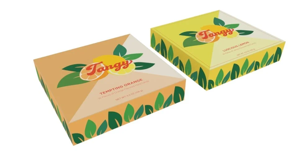
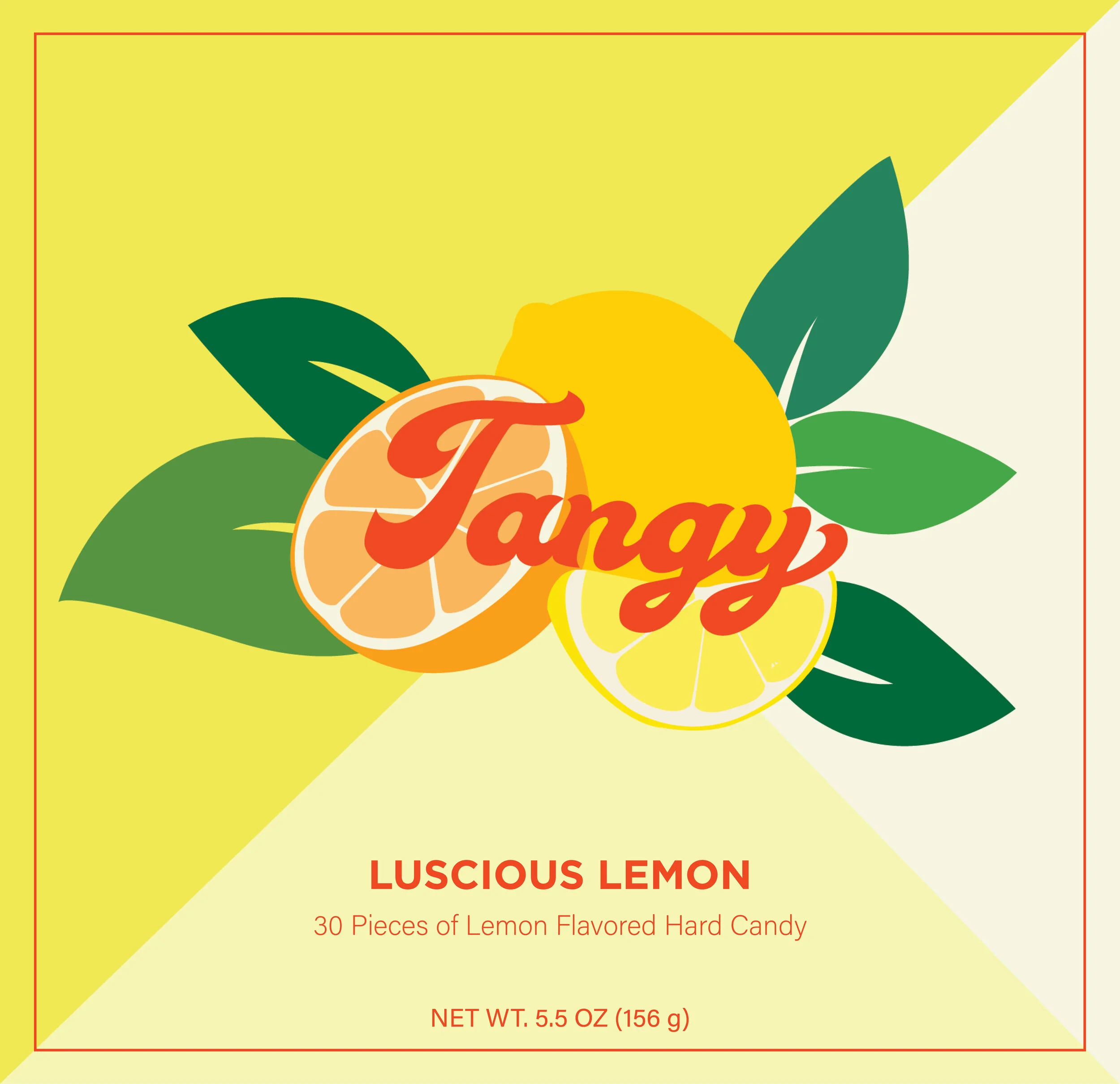
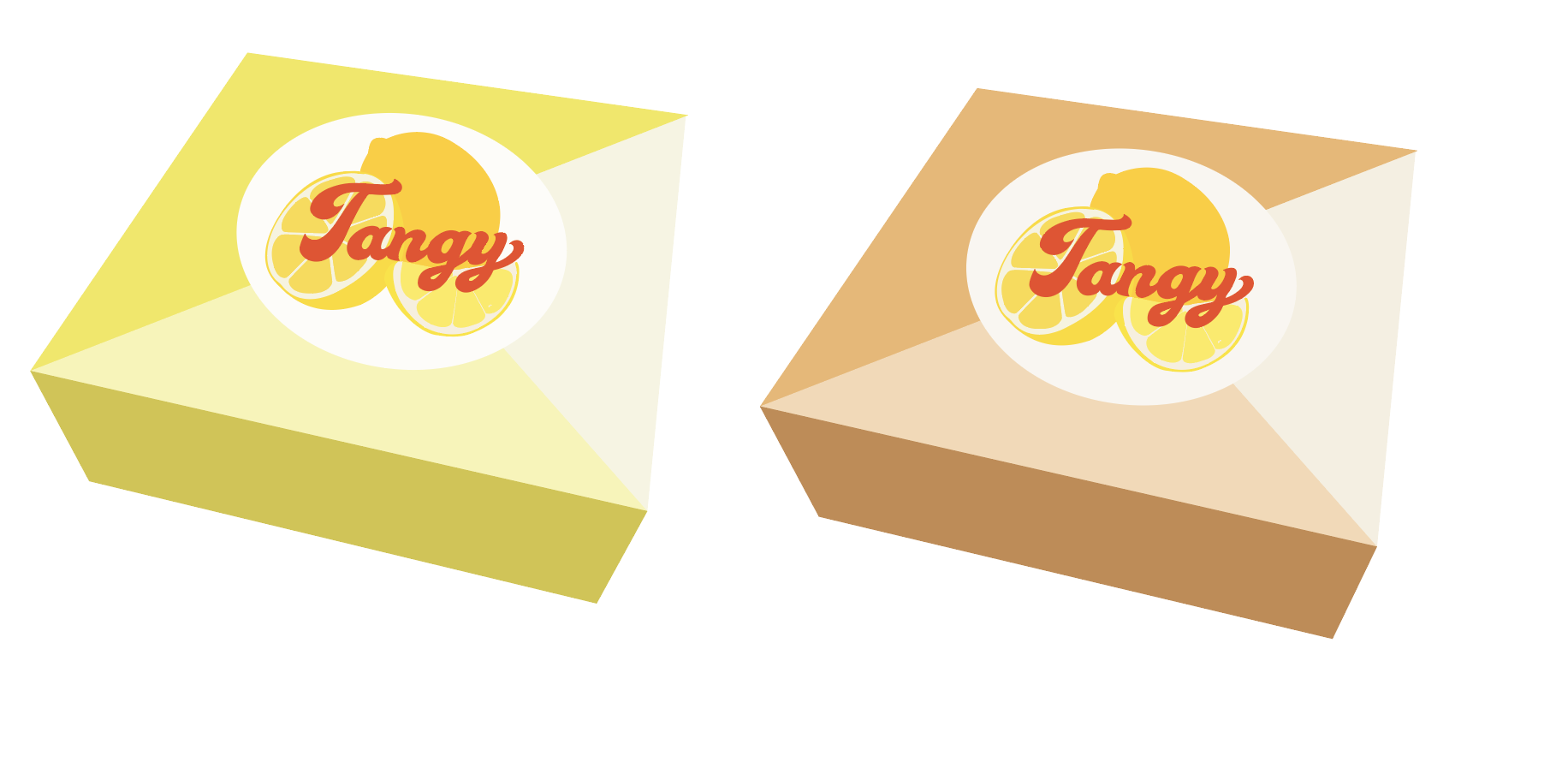
Tangy Single Box Packaging
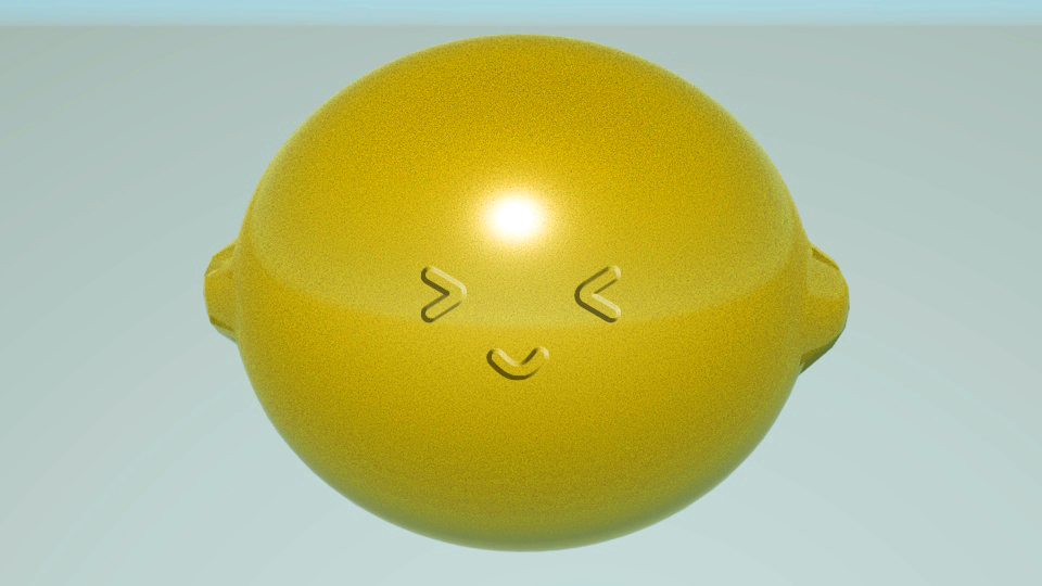
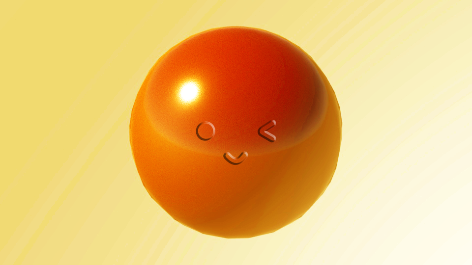
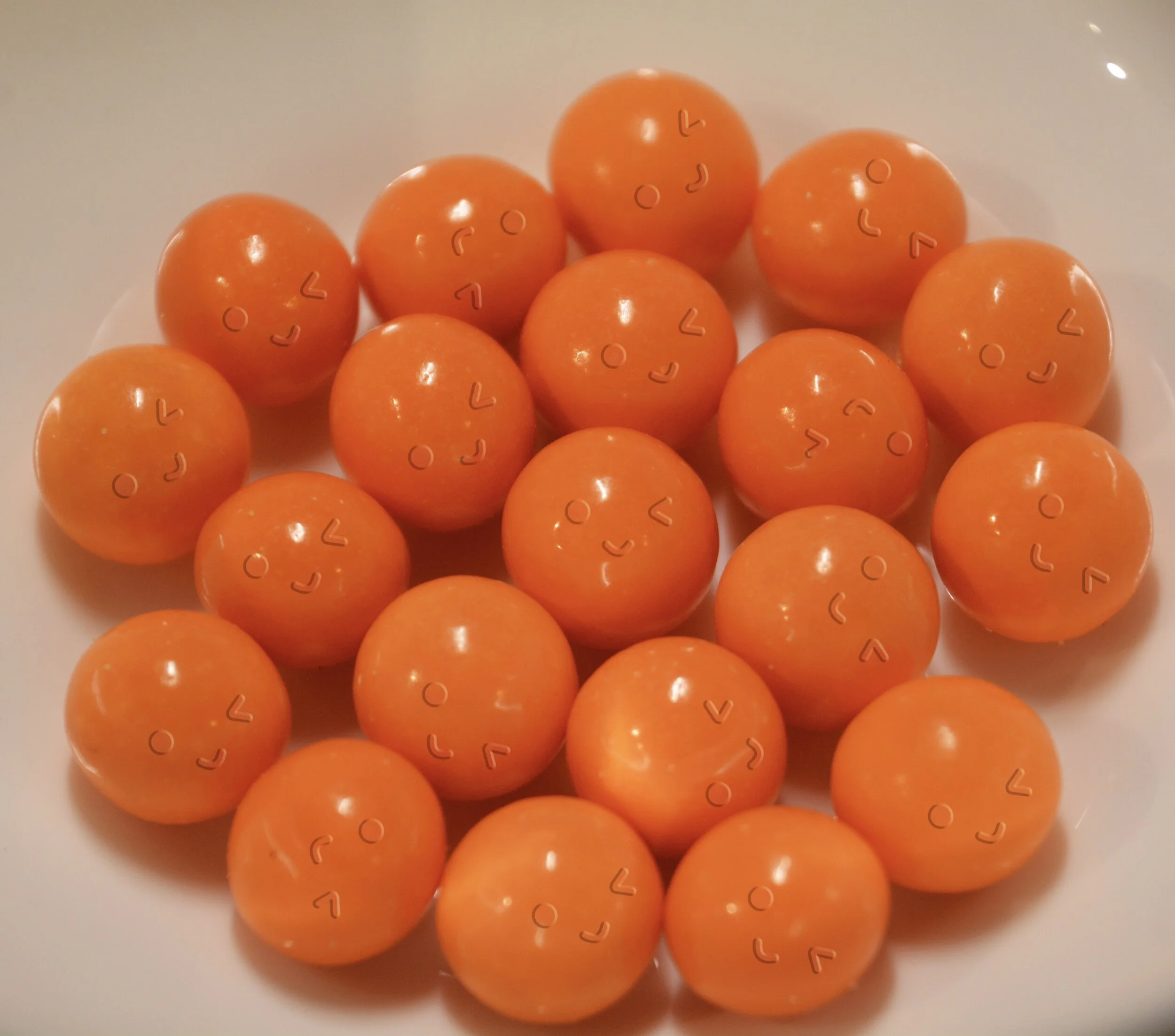
The logo includes the flavors lemon and oranges and the different box packagings indicated which flavor hard candy is held within. The yellow box has the lemon hard candies while the orange box hold the orange candy.


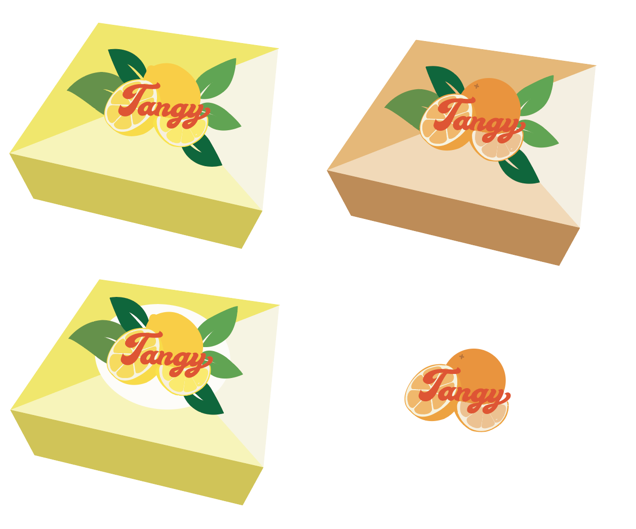
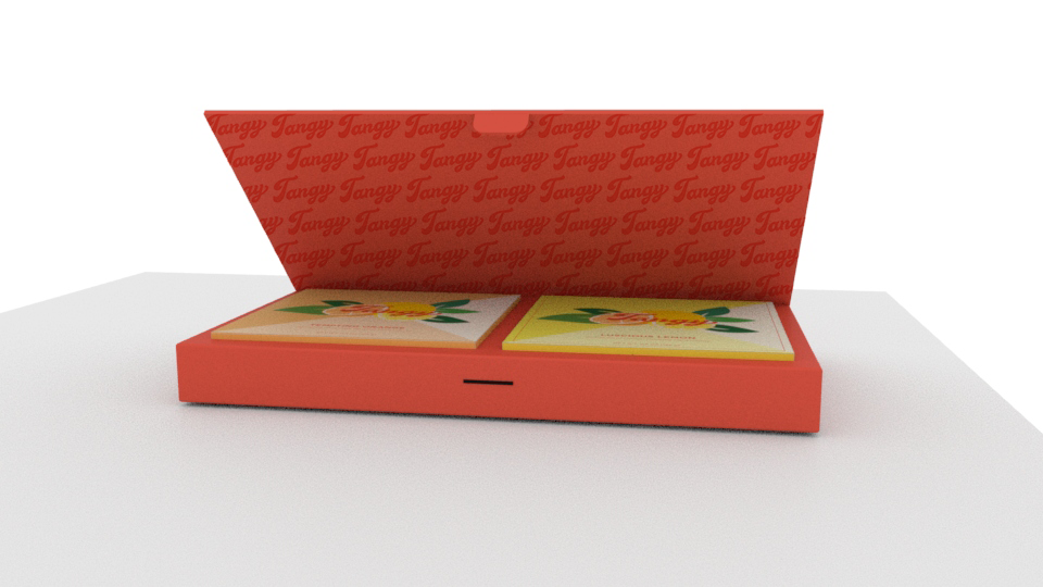
Outer Box Packaging

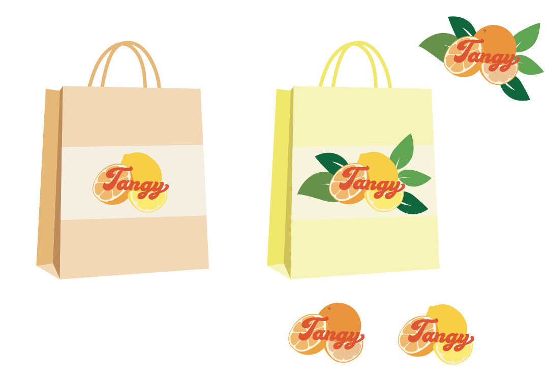
Two-Set Packaging
As a set, the two different flavored hard candies can be packaged together as a set so that both flavors are included with the original packaging design within.


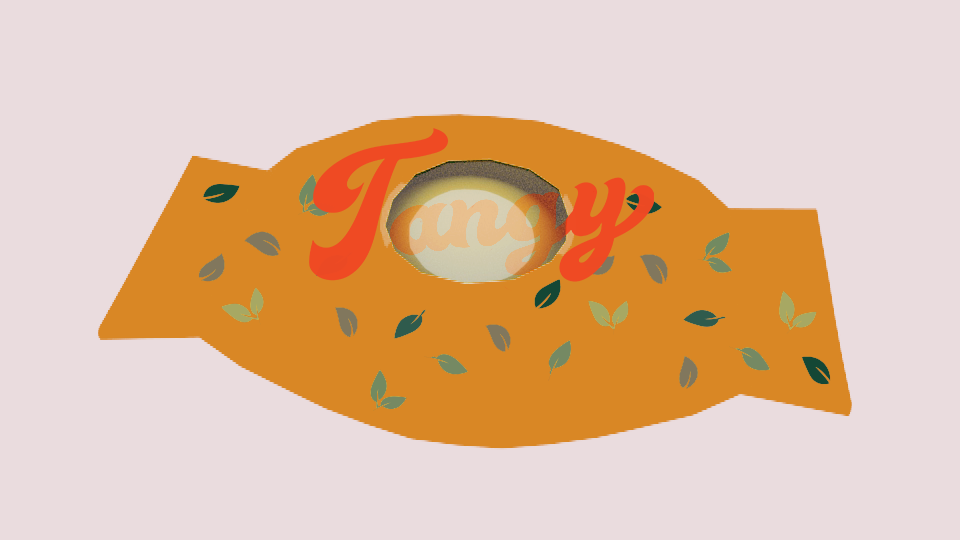
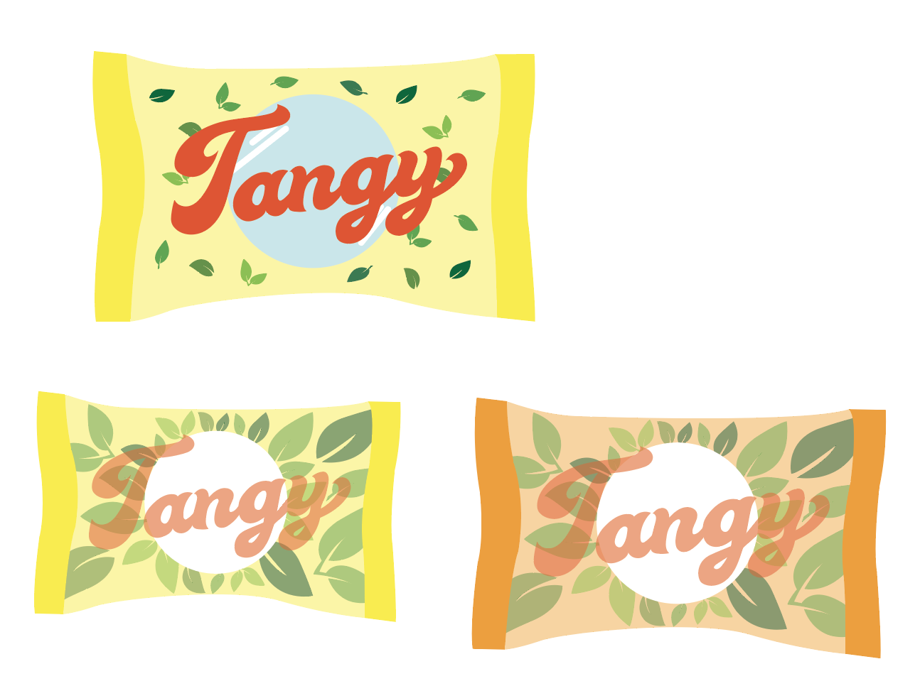
Packaging Patterns
For the two boxes, I rendered them in Autodesk MAYA and formatted the box layout and design through the use of Adobe Indesign, Illustrator, and Photoshop. The logo and pattern were drawn in the vector art form, which I created through Illustrator, and I formatted the Nutrition Facts using InDesign. Finally, the box layout was all done in Photoshop before I transferred all of it to MAYA for the final package render.


Design Process
I went through multiple revisions of the logo design and font before settling with the final result. Likewise, all the other aspects of the candy packaging included constant revisions to continuously make the overall style better.